As we know, Microsoft Excel has many features that help us to process numbers. Among its many features, Microsoft Excel helps us to make
charts. This feature provides a way to add visual appeal to our reports. In Excel 2013, there are ten types of chart. Each of chart types has different features so it will be better if we use the right type. Because each of chart types is
better suited for specific tasks, then we must understand what is the different between them and what are their functions. To make the information easier to understand, we must pair a chart with its correct data style. Here the ten available chart types in microsoft excel.
Cart Types in Ms Excel
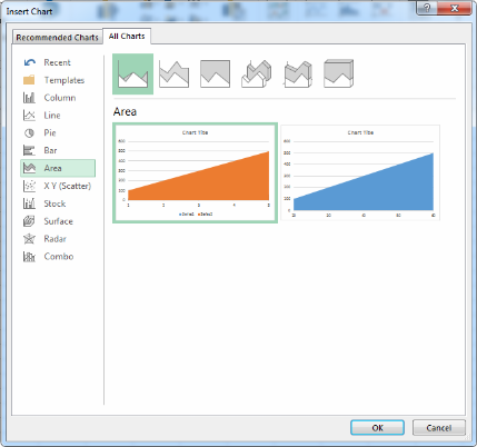
Excel allows you to create charts in a variety of types: Column Charts, Line Charts, Pie Charts, Bar Charts, Area Charts, Scatter Charts, Stock Charts, Surface Charts, Radar Charts, and Combo Charts.
- Column ChartsThe Column Chart effectively shows the comparison of one or more series of data points. But the Clustered Column Chart is especially useful in comparing multiple data series. The chart's horizontal axis presents the categories being charted, while the vertical axis shows the charted values. Vertical columns of differing colors rise from the horizontal axis to visually represent the desired data.
- Line ChartsThe Line Chart is especially effective in displaying trends. In a Line Chart, the vertical axis always displays numeric values and the chart's horizontal axis displays time or other category. The horizontal line connects the plotted points, providing a clear picture of data trends. Line charts work best when presenting data over evenly distributed time intervals.
- Pie ChartsThe Pie Chart divides a circle into slice to represent a data series. It can only display one series of data. It shows the values for that series as proportional slices of a pie. The chart depicts each pie slice in a different color for easy recognition of how the individual slice relates to the greater whole. Pie charts work best when you're charting only one data series, when none of your data are negative, when your data features no zero values and when you have seven values or fewer.
- Bar ChartsThe Bar chart is essentially horizontal column chart. It is like a Column Chart lying on its side. In bar charts, the chart's horizontal axis presents the the values, while the vertical axis shows the categories. Horizontal bars stretch left to right across the chart to plot the data. Bar charts are excellent for charting multiple values over extended durations, with colored bars representing each value.
- Area Charts
- Scatter Charts
- Stock ChartsStock charts are widely used to describe the fluctuations in the price of the stock. However, this chart can also be used for scientific data. For example, we can use it to show daily temperature fluctuations in an area.
- Surface Charts
- RadarRadar chart comparing the overall value of a number of data series.
- Combo Charts


No comments:
Post a Comment